Enhanced Select Component
The Select component is one of the most sophisticated components in the Fluxon UI library. Based on valuable user feedback, this release brings several meaningful improvements and fixes to enhance its functionality.
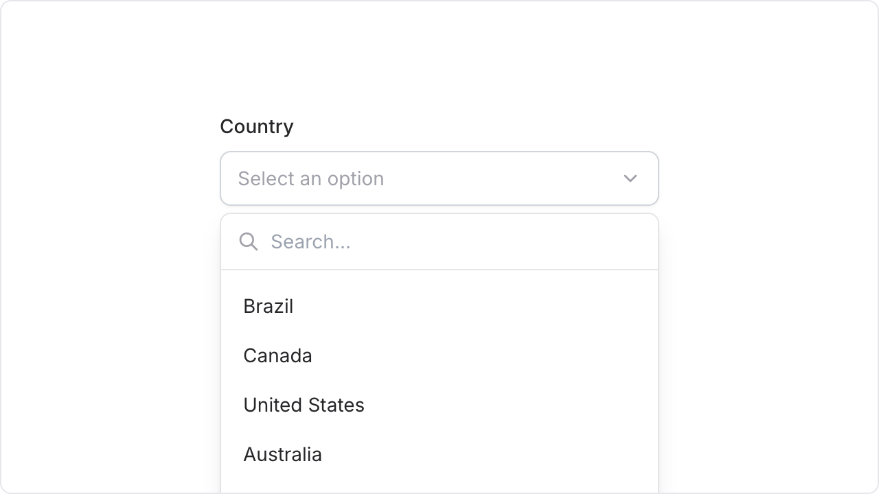
Here are the key updates to the Select component:
- Enhanced: Better handling of large option lists - the dropdown now automatically adjusts its height to fit the screen
- Enhanced: Search box remains fixed at the top while options scroll beneath it, improving search usability
- Enhanced: Smarter positioning - the dropdown now compresses up to 150px height when space is limited, rather than flipping to the top (see video below)
- Fixed: Error message now displays with consistent styling across form components
-
Fixed:
The
valueattribute now works correctly in combination with thefieldattribute - Fixed: Selected values properly reset when options are updated
- Fixed: Outline styling in the native variant aligns with the design system
The video below demonstrates the improved select positioning when screen space is limited:
Additional improvements in this release include:
- Improved alignment between error messages and their icons
- Enhanced focus-trap behavior for nested dialogs
- Added a new
hide_close_buttonoption for both modal and sheet components