Tooltip
Hover- and focus-triggered hint with placement, delay, and rich-content options.
Basic
Placement
Set the preferred side with placement. The tooltip flips and shifts when there is not enough room.
Hover delay
Set the hover delay in ms with delay; delay={0} shows instantly. Once one tooltip opens, neighbors skip the delay for a short warmup window.
Relative timestamp
Show a relative time inline and reveal the full date on hover.
Status indicator
Wrap a colored dot in a tooltip so hovering explains what the color means.
Custom colors
Classes passed via class stack on the defaults, so background, text color, padding, and shape can all be overridden.
Rich content
Skip value and use the :content slot for multi-line copy, headings, or any HEEx markup. Cap the width with class="max-w-*".
Setup integration
Connect your account to a third-party service to sync data automatically.
Image preview
The :content slot accepts images. The cursor can move onto the tooltip without dismissing it, so previews stay readable.
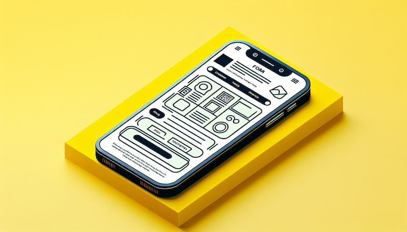
Wireframe UI
A visual guide for app layouts, showcasing key elements before the final design.
User profile
Hover an avatar or mention to surface a profile card with status and details.

Maya Hernandez
Senior Designer
Keyboard shortcut
Pair an action label with its shortcut by composing the :content slot with a styled kbd.
External trigger
Point target at a CSS selector when the trigger can't be a direct child. The tooltip listens for hover and focus on the matched element.
Form field help
Place a tooltip inside an input's :inner_suffix slot to attach contextual help without crowding the label.