TailwindCSS 4 and Phoenix 1.8 Support
Excited to announce Fluxon v1.1! This release brings full compatibility with TailwindCSS 4 and Phoenix 1.8, along with updated installation instructions and improved ways to handle component conflicts. Plus, there are some cool new dashboards to check out.
TailwindCSS 4 and Phoenix 1.8 Support
All Fluxon components have been revised and updated to work seamlessly with TailwindCSS 4, which comes bundled with Phoenix 1.8. This means you can use Fluxon in your latest Phoenix projects without compatibility worries or extra configuration steps.
While this update primarily focuses on TailwindCSS 4 compatibility, it works perfectly with Phoenix 1.7 as well, provided you've updated to TailwindCSS 4. The key requirement is TailwindCSS 4, not necessarily Phoenix 1.8.
Updated Installation Process
TailwindCSS 4 changed how it processes classes, so the installation process has changed too. Instead of
configuring tailwind.config.js, you'll now add Fluxon to your app.css file using
the new @source directive:
@import "tailwindcss" source(none);
@source "../css";
@source "../js";
@source "../../lib/phx_app_web";
@source "../../deps/fluxon/**/*.*ex";
This approach aligns with TailwindCSS 4's source file detection and ensures all Fluxon component classes are properly processed. For complete setup instructions, check out the installation guide.
Improved Component Conflict Resolution
The skip_conflicts: true
option when importing Fluxon has been deprecated. Now you can use the more explicit only
and except
options for better control over component imports:
# Import all Fluxon components except those that conflict with CoreComponents
use Fluxon, except: [:button, :error, :input, :table]

# Or import only specific Fluxon components
use Fluxon, only: [:dropdown, :modal, :sheet]
This gives you precise control over which components you want to use and helps avoid conflicts with Phoenix's CoreComponents more effectively.
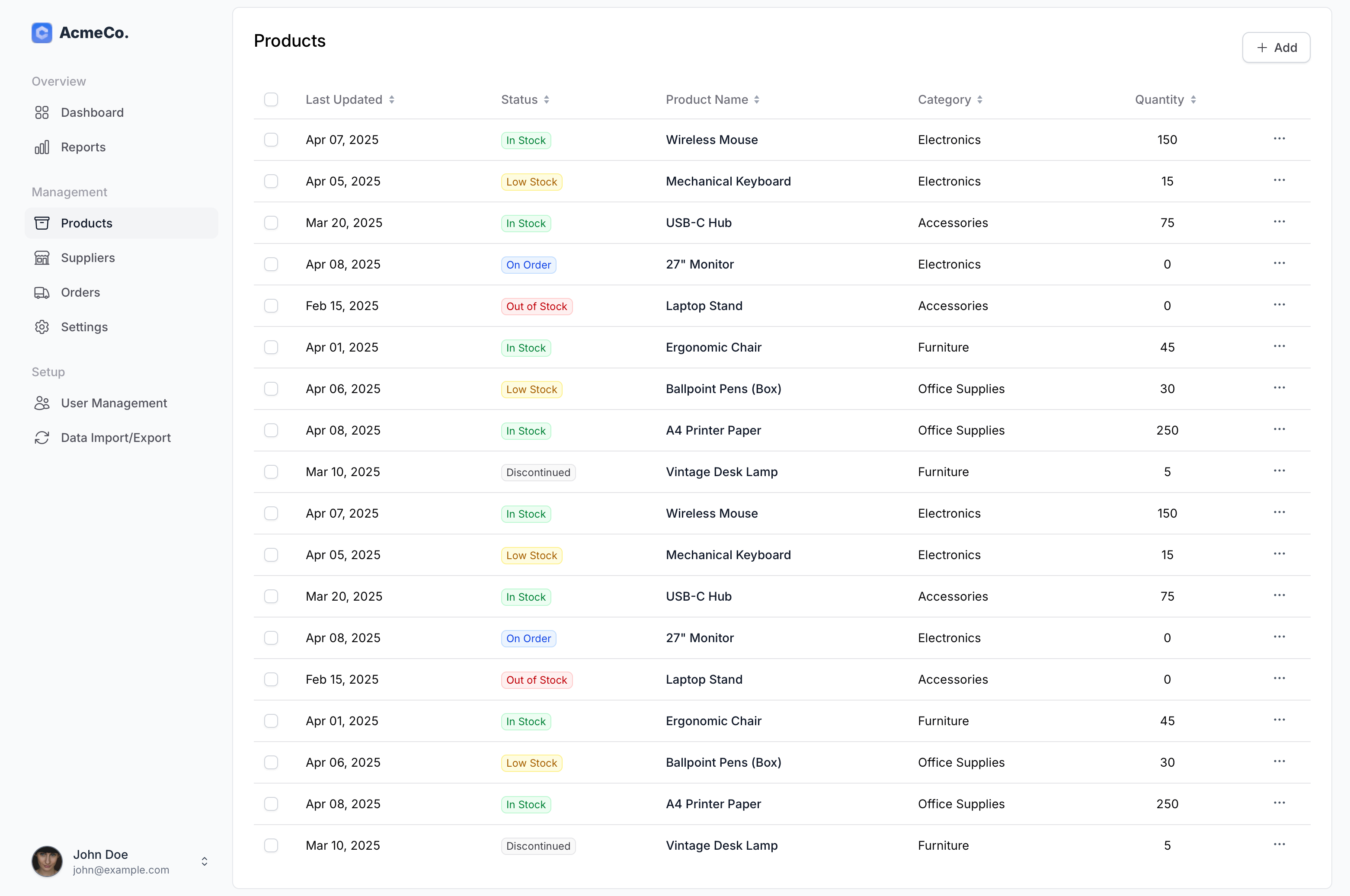
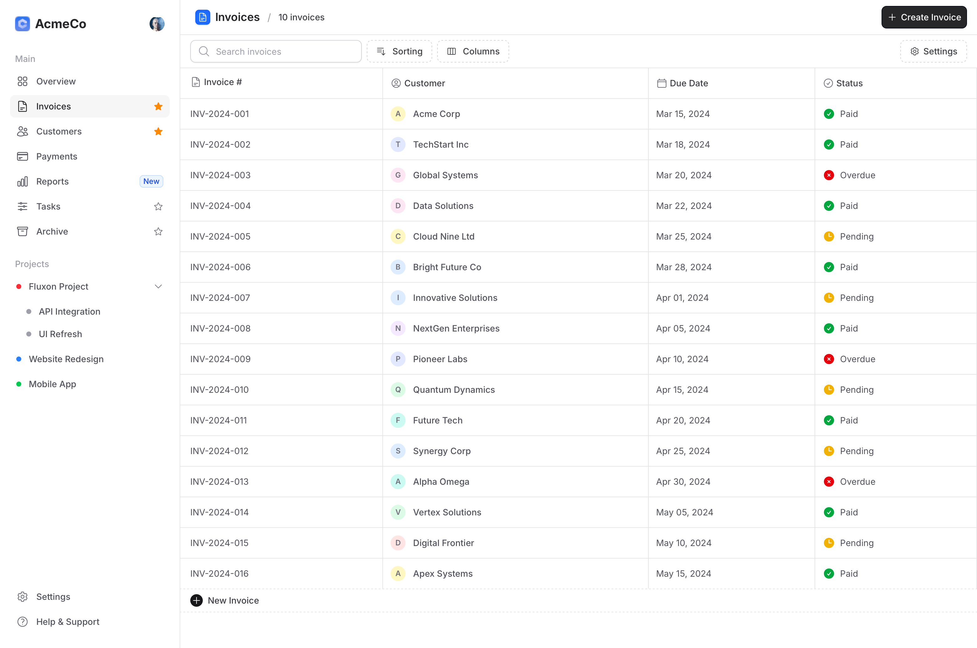
New Dashboard Templates
This release also includes two new dashboard layouts that showcase Fluxon components working together. These templates provide an excellent starting point for new projects and demonstrate how to combine various Fluxon elements into cohesive, functional interfaces.